Boston Neighborhood Demographics, 2013-2017, American CommunityThe data to compare are; Comparing these things shows that; We want to tell this story because When I was looking for datasets, I found this dataset which contains demographic data for Boston's neighborhoods. The comprehensive dataset, as is shown below, contains key factors that contribute to a story.  Worksheet - Index As can be seen from the excel, the dataset has 23 different index, each of them representing different aspects of demographics of American community in Boston. So, I think it might be a good idea to choose 2 to 3 relevant index and make a comparison. Therefore, I decided to do a comparison story. The three index I choose are: Means of Commuting, Travel Time to Work and Vehicles per Household. I think comparing the three data can show the commuting environment in different neighborhoods, and also generally in Boston. Just by looking at the first graph, we can found that Dorchester has the greatest amount of workers 16 years old and over, and then comes Brighton and East Boston. 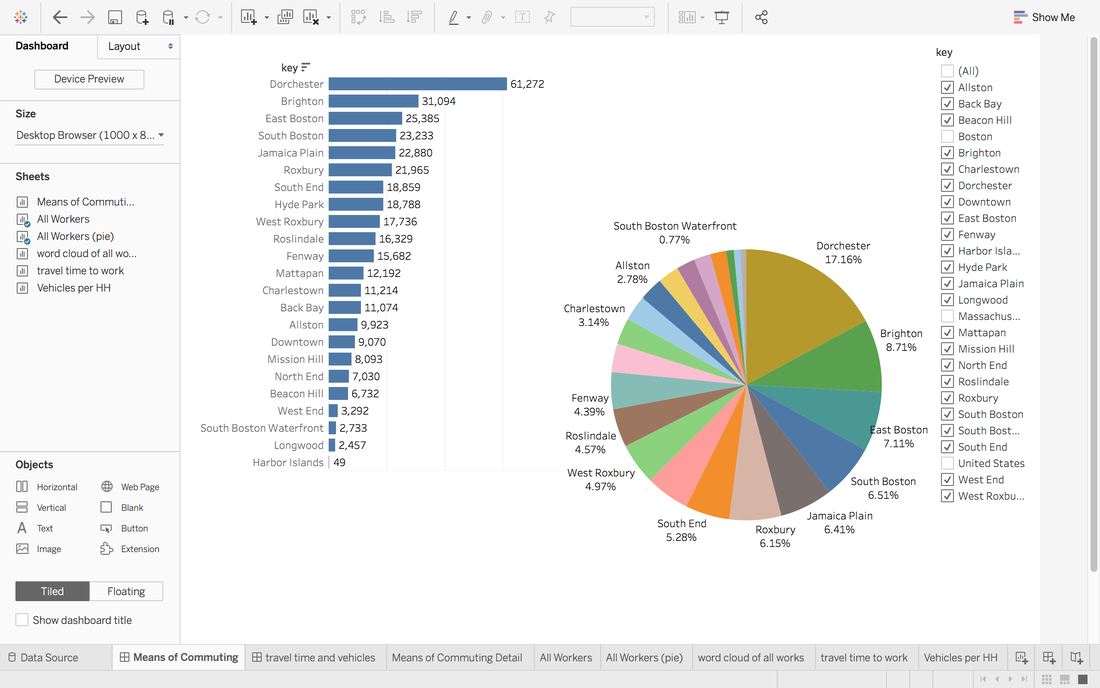 Graph 1 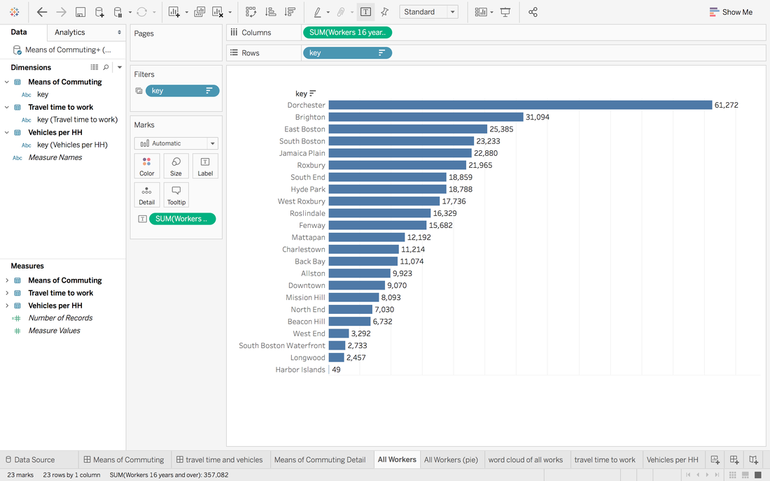 Graph 1.1 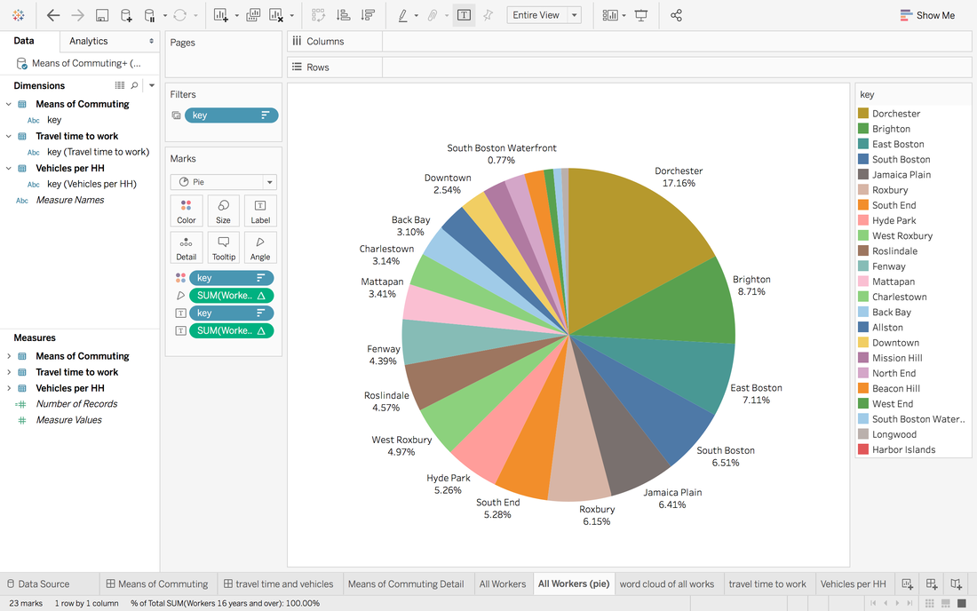 Graph 1.2 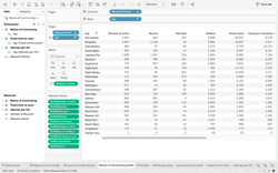 Graph 2 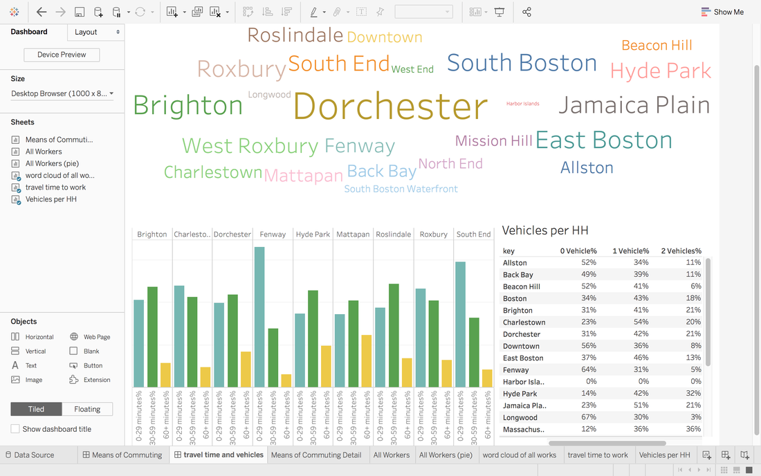 Graph 3 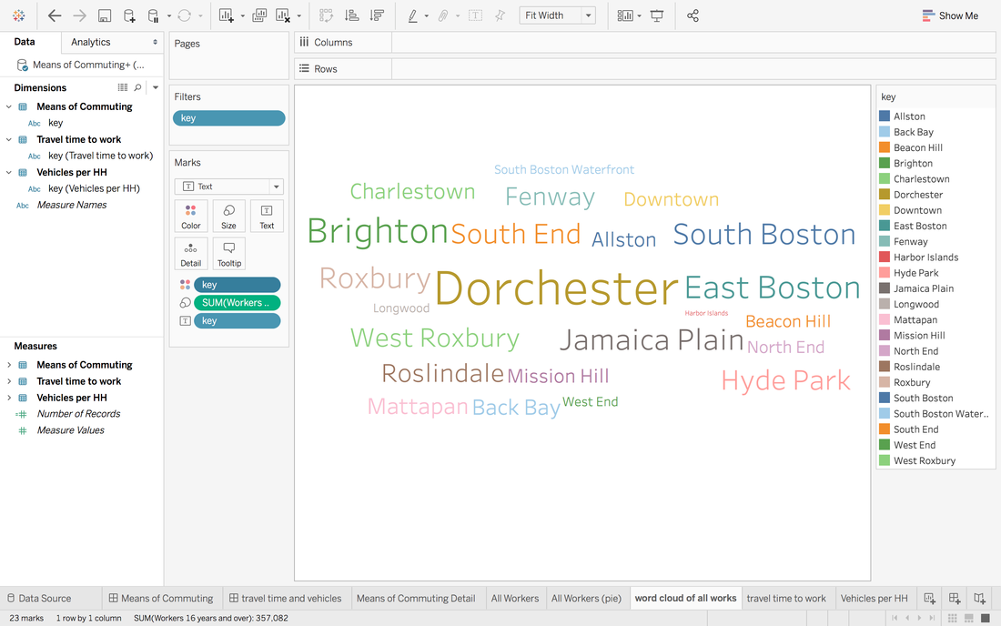 Graph 3.1 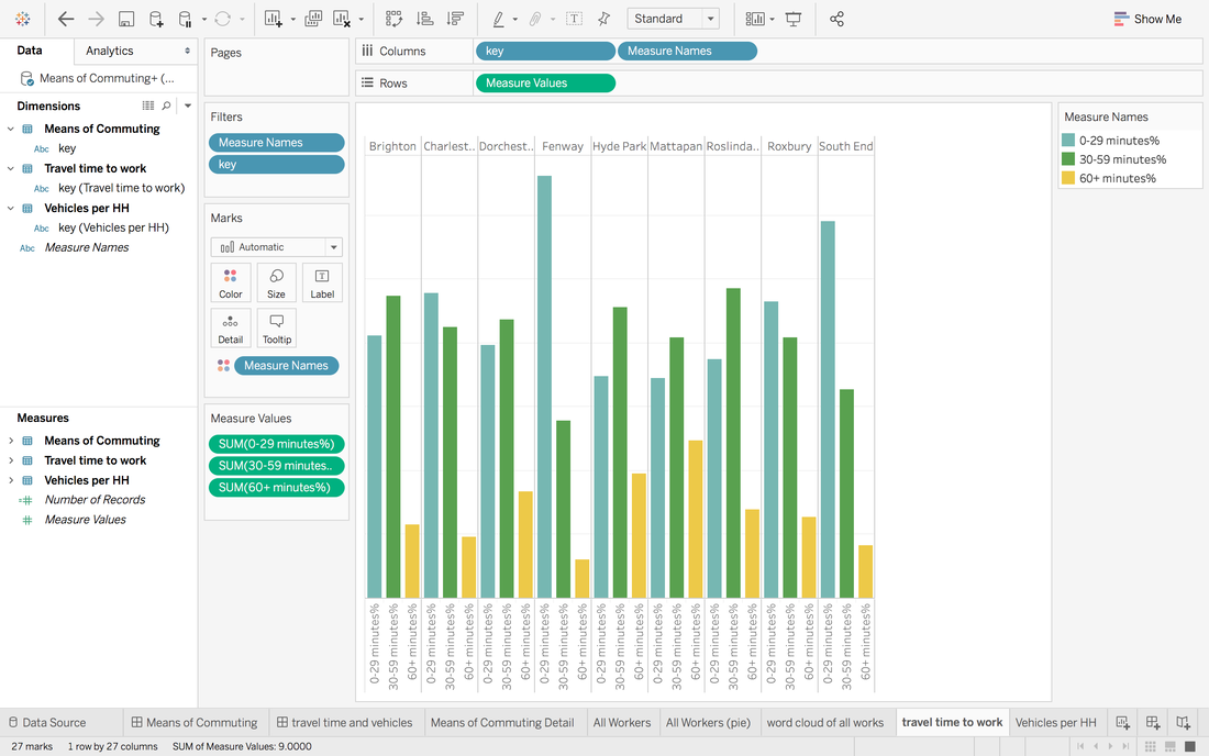 Graph 3.2 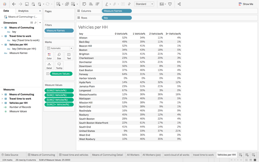 Graph 3.3 Source: Boston Planning and Development Agency.
Download datasets here.
0 Comments
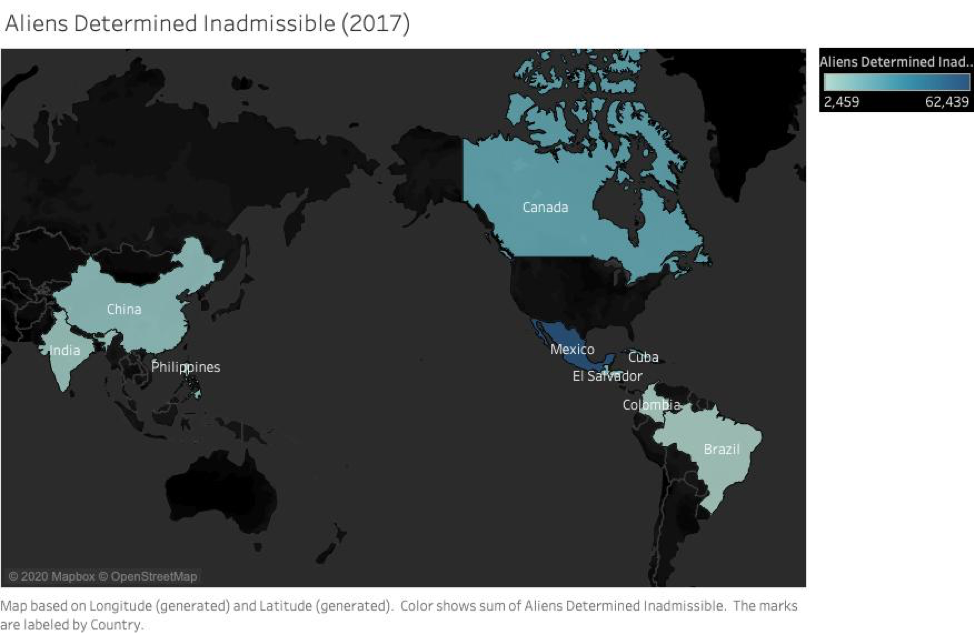 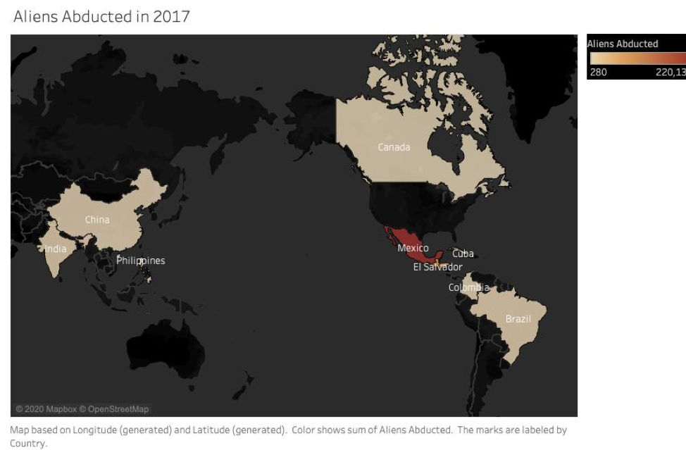 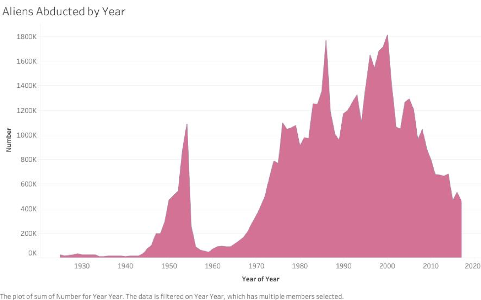 Questions 1. Where did this data come from? 2. Does this chart reflect the maps above? Or just represent one country? 3.What sparked the rise in reportings of immigrant abductions? We choose to do the three charts as we believe it reflects the relationship between countries where aliens determined inadmissible and aliens abducted. From darker blue to lighter blue, the color indicates the sum of aliens determined inadmissible. It is a similar case with the second chart. However, we hope to know more about the context of the data as it is not that clear what aliens mean in these countries. Nevertheless, data shows in 2017, aliens were determined inadmissible mostly in Mexico and comes with Canada, China, India, El Salvador, Brazil, Columbia, Cuba. According to maps, in 2017, Mexico had the largest number of aliens abducted, EL Salvador comes the second. China, Canada, India, Brazil, Cuba, Columbia also have a large sum of aliens abducted. The third chart illustrates that the difference of the sum of aliens abducted by years. We choose this form of chart because we think it better reflects the changes and amount in every decade. There was a peak in the 1950s, but it had a rapid decrease in the 1960s. After that, we can see it had been increasing and had the highest sum between the 1980s and 1990s, and in the 2000s. However, the trend shows after the 2010s, the sum of aliens abducted has been decreasing so far. What is the design question?
1. Are the goal, purpose, and objectives of the project clear? Our project goal will be to create engagement between the audience and the newsrooms or community-based organizations that provide news or information for the people. Based on the research on Hearken, we knew that the engagement between the newsroom and the audience in the process of news production needed to be improved. At first, we discussed and defined the problem statement too generally, like revolutionizing the way people used to interact and consume news or streamline the news cycle. However, after several meetings, we knew that we should narrow it down. For today's news, we have come up with a few main questions we’re interested in exploring. In this digital era, how to resolve the decreasing trust in online news? How do we create more engagement between the audience and the journalists? How to help the newsroom produce the news that people care about in the community? These are also the goals we want to achieve in this project. 2. Who is the audience? Our audience will be the people in the community of Boston area. We haven't decided which local newsroom we would like to test our prototype yet. However, we are trying to make more connections with the local organizations now. 3. What was the need identified? We need to identify a conflict that can bring out the research for our project. Once we understand a problem that can become researched, our design question can be reached. For example, is Hearken having a problem with trying to explain what it is to their audience? If so, then we can base our outcomes around this central conflict. 4. Why is it important to solve this now? It’s important to solve this now so that Hearken can improve its efforts going forward. Since the company is so underdeveloped, applying our research to their system could help them in the future. If Hearken doesn’t get some help in improving its public perspection of how it operates, then less people will take advantage of its services. 5. What are the key points? Based on our previous research on startup companies like Hearken, many of them use different technologies and platforms for more creative and engaging content. However, what makes an audience come back to the content is critically important for the reporters to produce news of recognized values in the communities. It implies that listening to the audience and learning what they want helps build trust between reporters and the audience. We also need to figure out how audience engagement relates to a better public-powered newsroom. And perhaps most important of all, how could we design an engaging platform that integrates communities into newsrooms? 6. What is your intention with the project? As many traditional newsrooms are striving to survive and evolve in a more competitive media environment with emerging technologies, the support and engagement from audiences seem to be crucially important. One of the goals of the project is to build deeper relationships and stronger interactions between reporters and the audience. By helping newsrooms incorporate their audience’s opinions into the pitch and reporting phase, reporters will be able to send updated news to those who are interested in the stories. Engaged journalism means better understanding and connecting with the audience in the communities, promoting public-powered storytelling. Therefore, we want to develop a more engaging media platform that allows newsrooms to be more sustainable and accessible in the future. Stakeholders, who are they? Define Roles. 1.Consumers A target demographic Hearken is aiming for is for people who consume the most daily news. I believe this is the age range of 21-45. The audience of this age has the broadest range of interests in a variety of topics. These stakeholders hold the most potential interest in using services like Hearken to get the most out of their info consuming routine. 2. Employees The employees in Hearken will be our project partner, since Hearken already has a lot of knowledge and experience in the news from the past to the present, we will discuss and test the designed prototype for the future of the newsroom together. These stakeholders hold the most information and resources in our target design area. 3. Users Users as stakeholders, such as media outlets, may provide insights from an external perspective to make sure the project is in line with larger institutional expectations and needs. The stakeholders will also help evaluate the project in the design process of assessment. City of Boston’s Employee Earning’s Report 1. Who collects this data set? If it's an organization, which department of the organization? Is there a specific person listed who you could contact?
This data set was collected from the Boston Police Department. No specific person is listed. 2. Why do you think the organization collects this data? Does it specify how it uses the data? Although this data set doesn’t specify how the information is used, I have to assume that perhaps by keeping these records we can see if there is any corruption or anything like that going on. 3. What time period does the data set cover? Based on the data set we have, unfortunately there isn’t a column that shows the timeline. Since it’s an annual report, the time period that data set cover will probably be the whole year of 2017. 4. What are some of the questions you have about this data set? (Note: they can be basic like "why is this data being collected?" or very specific like "what does the field BUS_LIC_STATUS mean?"). Some of the columns in this data set are hard to identify what they represent. What do the terms “retro” or “detail” define in terms of earnings? There is a column that also identifies the cost of education incentives for this type of employment. I know that some companies offer educational stipends to employers so how does this data set represent that? Another thing I noticed is the significant disparities in regular earnings between a police sergeant detective and a police officer (not specific). One police officer makes nearly eight times the amount of regular earnings as a detective but a detectives total earnings are more than some police officers. I think in order to read the data you would have to have some background information about these jobs and what the different columns represent to get a better context. 5. Who are three types of people you could interview about this data set in order to learn more? The types of people we would need to interview about this data are the people who work the types of jobs that are included in this data set. If you are lucky enough to know them, the data set includes people with their names! This makes me wonder if the names are included because they willingly offered up their earnings information or if it was taken without their consent. 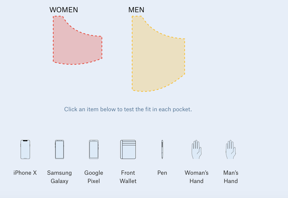 Women's pockets are inferior Women's pockets are inferior The data visualization blog I choose is the Pudding. In fact, I have been following the Pudding for months since the first time I was attracted by its contents in the form of visual essays. I am a fan of minimalism, so the way they present the stories and data, concisely and vividly, was very impressed to me. In this case, the complex data sets and explanations are easier for the audience to understand and remember. Apart from that, many topics they choose for the data analysis and visualization easily catch audience’s attention, such as why women’s pockets are inferior, The birthday Paradox Experiment. More importantly, one of the major differences that it has compared to other traditional data websites is that their data stories create an engaging and constant experience for the audience. In some stories, the findings are not a final publication, but are updated and vary by months or year based on algorithm. 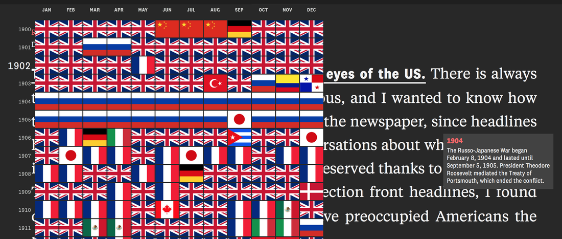 The world in the eye of US 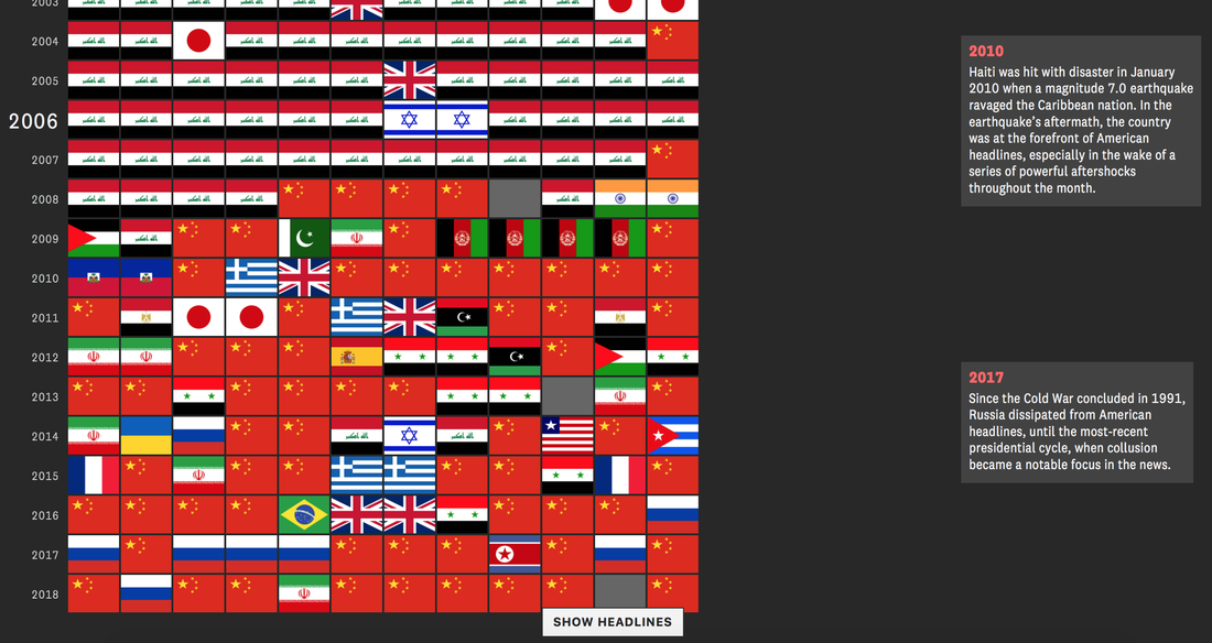 The world in the eye of US |
AuthorWrite something about yourself. No need to be fancy, just an overview. Archives
April 2020
Categories |
 RSS Feed
