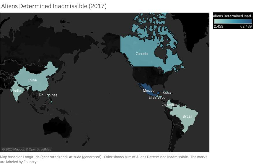
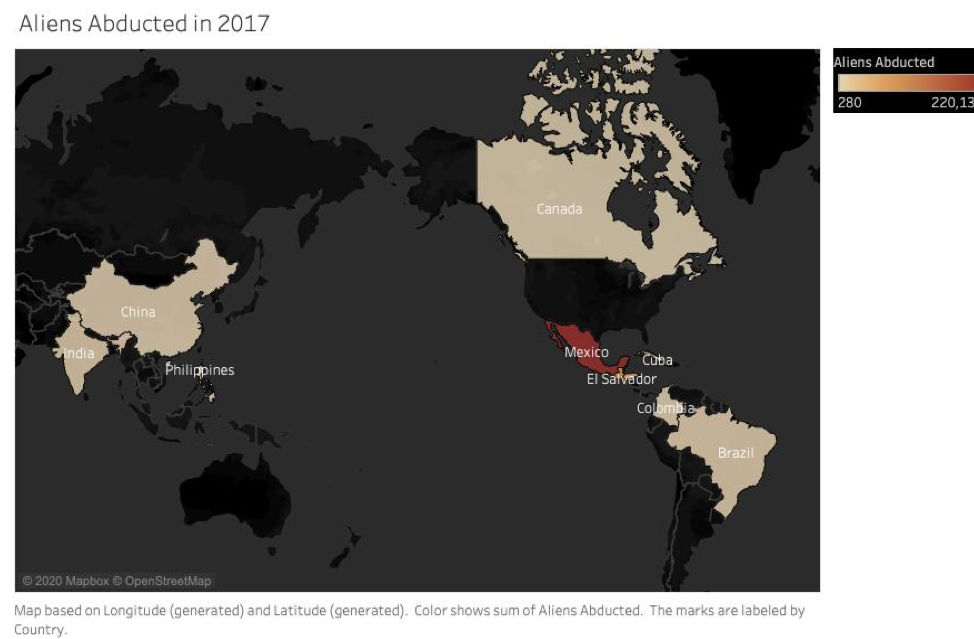
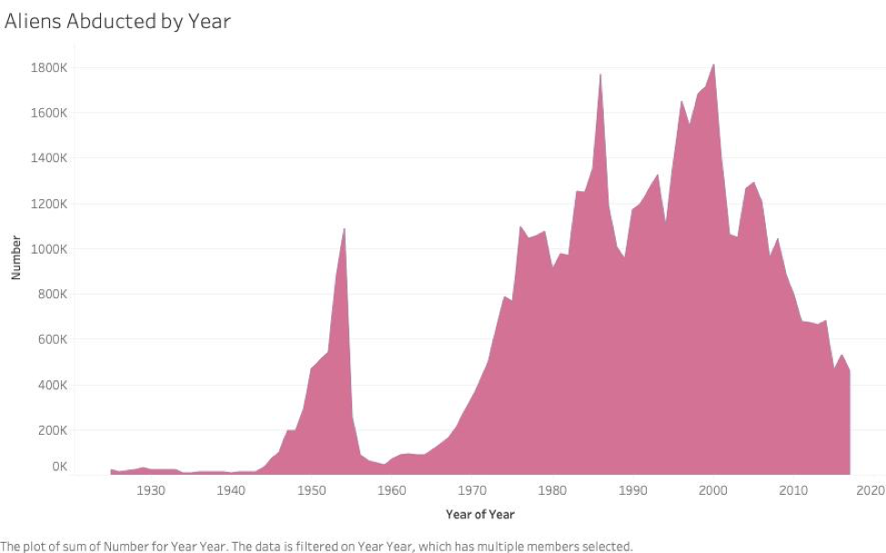
   Questions 1. Where did this data come from? 2. Does this chart reflect the maps above? Or just represent one country? 3.What sparked the rise in reportings of immigrant abductions? We choose to do the three charts as we believe it reflects the relationship between countries where aliens determined inadmissible and aliens abducted. From darker blue to lighter blue, the color indicates the sum of aliens determined inadmissible. It is a similar case with the second chart. However, we hope to know more about the context of the data as it is not that clear what aliens mean in these countries. Nevertheless, data shows in 2017, aliens were determined inadmissible mostly in Mexico and comes with Canada, China, India, El Salvador, Brazil, Columbia, Cuba. According to maps, in 2017, Mexico had the largest number of aliens abducted, EL Salvador comes the second. China, Canada, India, Brazil, Cuba, Columbia also have a large sum of aliens abducted. The third chart illustrates that the difference of the sum of aliens abducted by years. We choose this form of chart because we think it better reflects the changes and amount in every decade. There was a peak in the 1950s, but it had a rapid decrease in the 1960s. After that, we can see it had been increasing and had the highest sum between the 1980s and 1990s, and in the 2000s. However, the trend shows after the 2010s, the sum of aliens abducted has been decreasing so far.
0 Comments
Leave a Reply. |
AuthorWrite something about yourself. No need to be fancy, just an overview. Archives
April 2020
Categories |
 RSS Feed
