Boston Neighborhood Demographics, 2013-2017, American CommunityThe data to compare are; Comparing these things shows that; We want to tell this story because When I was looking for datasets, I found this dataset which contains demographic data for Boston's neighborhoods. The comprehensive dataset, as is shown below, contains key factors that contribute to a story.  Worksheet - Index As can be seen from the excel, the dataset has 23 different index, each of them representing different aspects of demographics of American community in Boston. So, I think it might be a good idea to choose 2 to 3 relevant index and make a comparison. Therefore, I decided to do a comparison story. The three index I choose are: Means of Commuting, Travel Time to Work and Vehicles per Household. I think comparing the three data can show the commuting environment in different neighborhoods, and also generally in Boston. Just by looking at the first graph, we can found that Dorchester has the greatest amount of workers 16 years old and over, and then comes Brighton and East Boston. 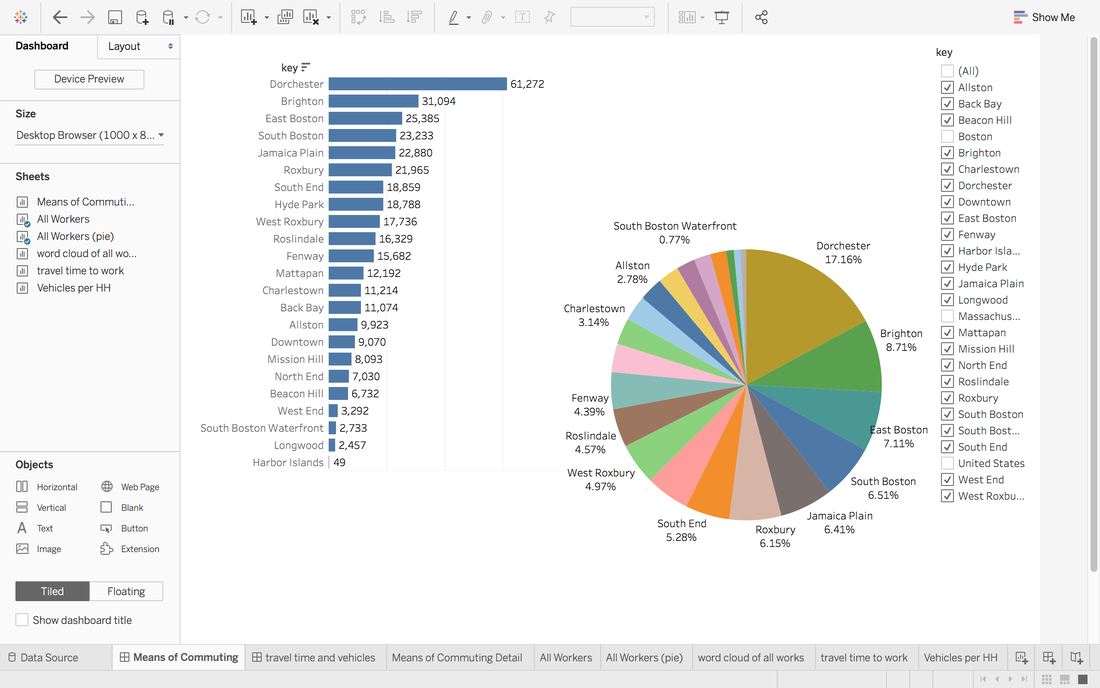 Graph 1 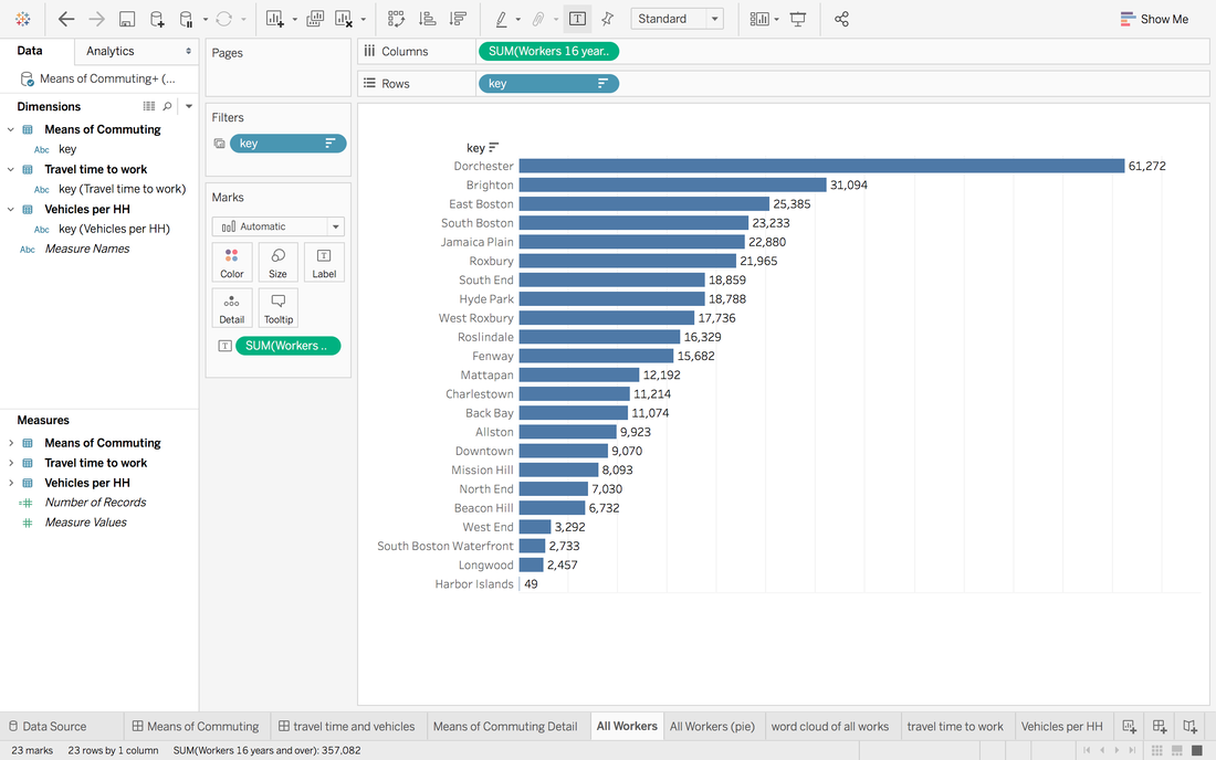 Graph 1.1 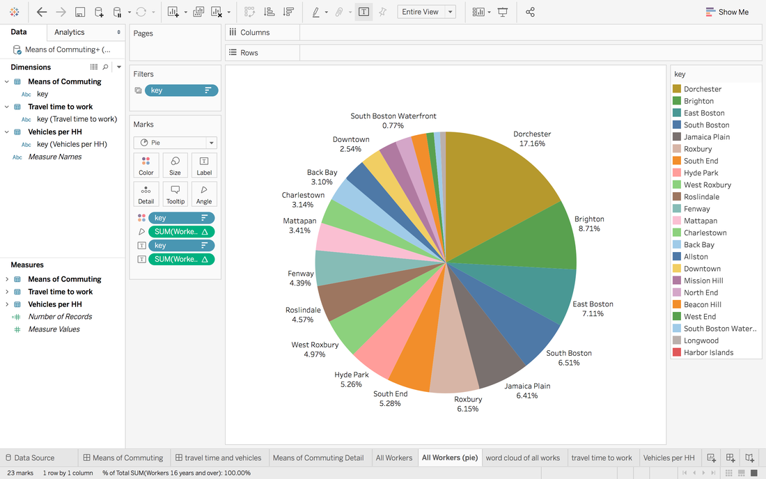 Graph 1.2 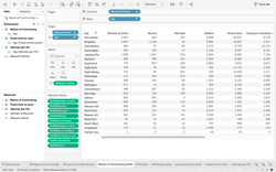 Graph 2 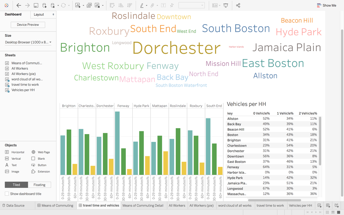 Graph 3 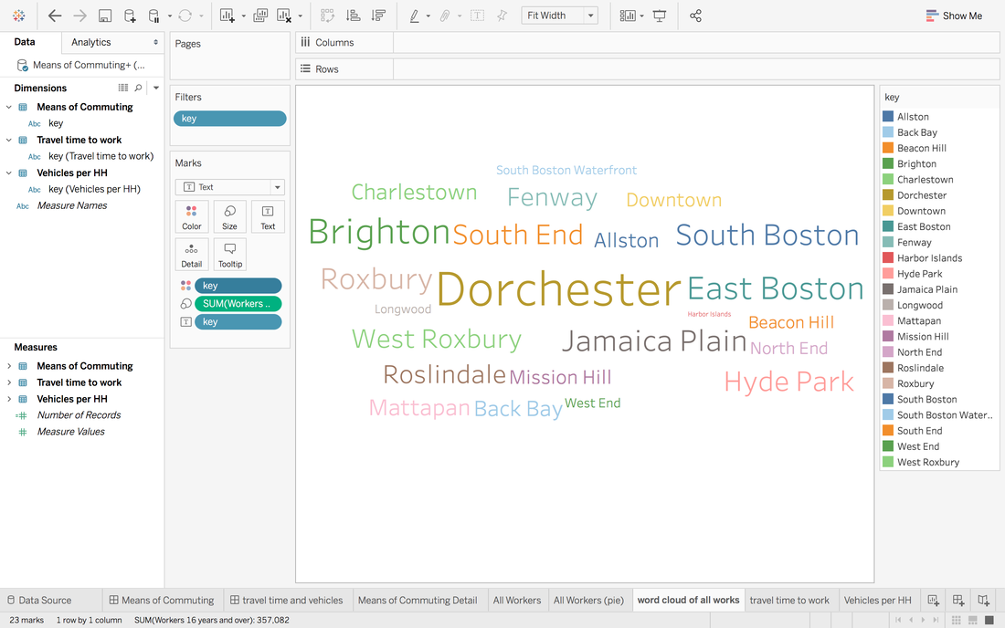 Graph 3.1 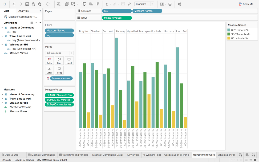 Graph 3.2 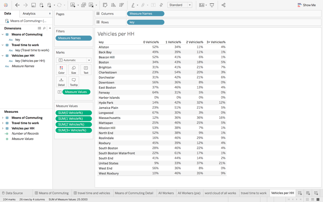 Graph 3.3 Source: Boston Planning and Development Agency.
Download datasets here.
0 Comments
|
AuthorWrite something about yourself. No need to be fancy, just an overview. Archives
April 2020
Categories |
 RSS Feed
