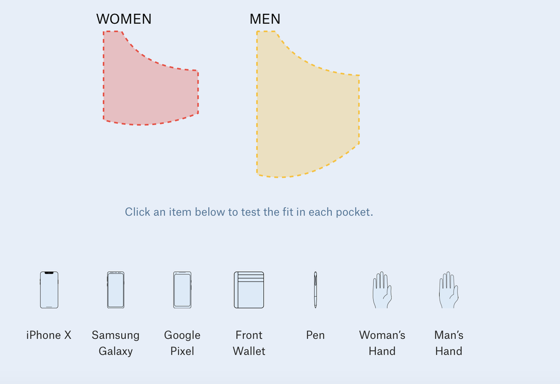
 Women's pockets are inferior Women's pockets are inferior The data visualization blog I choose is the Pudding. In fact, I have been following the Pudding for months since the first time I was attracted by its contents in the form of visual essays. I am a fan of minimalism, so the way they present the stories and data, concisely and vividly, was very impressed to me. In this case, the complex data sets and explanations are easier for the audience to understand and remember. Apart from that, many topics they choose for the data analysis and visualization easily catch audience’s attention, such as why women’s pockets are inferior, The birthday Paradox Experiment. More importantly, one of the major differences that it has compared to other traditional data websites is that their data stories create an engaging and constant experience for the audience. In some stories, the findings are not a final publication, but are updated and vary by months or year based on algorithm. 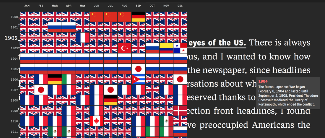 The world in the eye of US 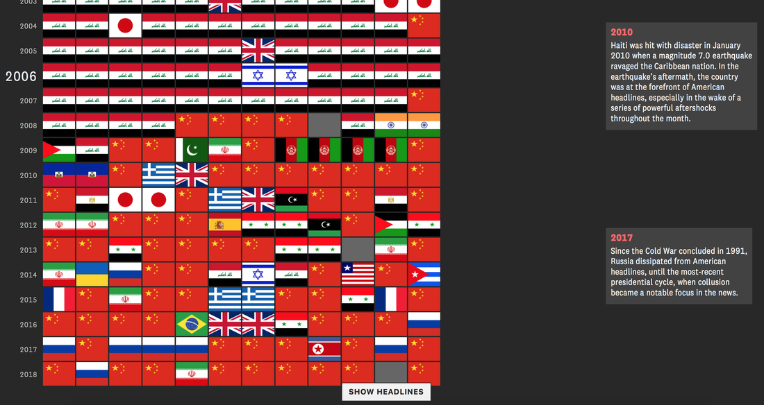 The world in the eye of US
0 Comments
Leave a Reply. |
AuthorWrite something about yourself. No need to be fancy, just an overview. Archives
April 2020
Categories |
 RSS Feed
